CPB
Workspace refurbishment for collaboration and play
Kings Cross, N1
19,500 sq ft
Support collaborative working
Designed for inspiration
Creation of a social hub
Creative office refurbishment within a stunning industrial space
The global, award-winning creative and advertising agency CPB called us in late 2014 to rework their beautiful listed building. We collaborated with them to create a fully functional and stylish workspace to cater to all of their needs. The space in a former tram shed had striking architectural features but was dysfunctional in its user experience and functionality.
A fantastic multipurpose cafe/collaborative space on the mezzanine overlooked the workspace and made a brilliant informal working area. The new layout allowed for long runs of desks for the teams in the open-plan office. In addition we overhauled the reception area to give it some ‘wow’ whilst adding a master boardroom as key focal point.
Designing flexible, collaborative spaces
There were some existing meeting rooms in the office but the layout was lacking in flexible and informal areas for collaboration so this was key to the reworking of the space plan. We added flexible furniture and white boards on wheels to previously under-utilised spaces. As an advertising agency these types of break out areas are critical and used frequently.
The large existing reception area gave us the opportunity to add in a boardroom plus additional break-out areas whilst retaining a warm welcome for clients and visitors. The transformation of the kitchen/cafe area on the mezzanine was key to creating a large sociable and buzzy space that also offered informal spaces to meet and work.
Informal meeting space on the mezzanine
Interior design led by industrial architecture
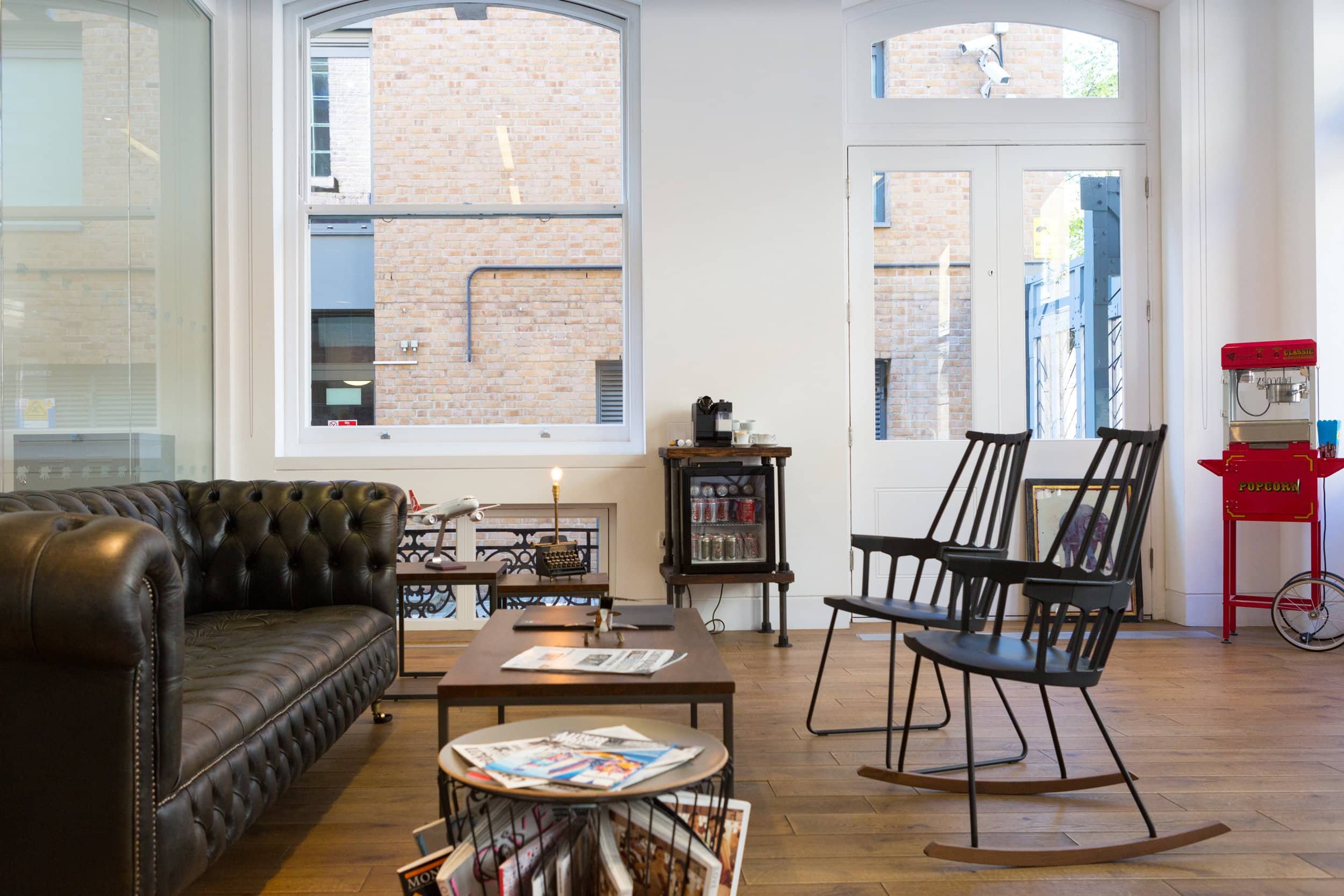
We let the building itself, rich with original and historic details, lead the design direction and the inherited palette of wood and brick offered a warm base. In keeping with that we added LVT wood-effect flooring and upcycled wooden furnishings alongside iconic furniture to stand the test of time. Pops of colour were introduced that tied to both the personality and branding of the agency. Playful pieces such as an old popcorn machine and quirky props that connected to their client roster helped to add interest, colour and surprise throughout the space.
Small touches such as the reorganising and curation of their ‘creative tools’ in a stationery display and a creative reference library were key to the success of the project. Taking an approach that was both practical and functional whilst being playful and creative was integral to meeting the client’s brief. The end result offered a variety of zones in which the teams could work, collaborate, communicate and create whilst retaining the sense of community that was so important to the agency.
Like what you see?
Get in touch to discuss your next workspace refurbishment project.
More of our work
Share this project:


