Acacia Avenue
An office refresh through transformational interior design
Angel, EC1
1,970 sq ft
Increased brand representation
Improved wellbeing for employees
Space planning for better use of space
Office design to represent the brand
When strategic research consultancy Acacia Avenue invited us over to see if we could help with their workspace, we were enthralled before we even visited the building. The visual brief emailed to us was an absolute delight to read. They wanted to capture the real essence of who they were within their working environment so that it created a more inspiring and connected space for the team, their clients and visitors.
One site visit later and we were hooked - it is not often we get the privilege of working within a entire Georgian property. The space, whilst full of character and light, was fairly neutral and did not match the personality, character nor quirk of this lovely close knit business.
Trifle* first played with a palette of colour and conceptual ideas that suited the individuality of Acacia Avenue. We added dark drama to hall and corridors; revamped bathrooms with charm; created three stunning meeting rooms and completely transformed a back office (which previously had a microwave on a wobbly table) into an attractive. communal, sociable cafe kitchen and meeting area.
It was enormous fun to work with this small agency with larger than life personality and everyone is happy with the space which now better represents their world.
Pillars of the design scheme
It was wonderful to work with Acacia Avenue who, as a a strategic agency, were very clear on their brief.
They asked us to design around four key pillars:
Warm
Intelligent
Witty
Vivacious
Warmth was defined as the feeling of being welcomed and hosted. We ensured that this was represented in the space through the use of warming colours, textures and references to nature. Acacia Avenue were keen that the scheme be warm but in a natural, calming and elegant way. They wanted to be gracious hosts in a non-corporate way.
Intelligence was realised through the use of space and storage, finding clever ways to store and display items. We reworked their space to include a more functional kitchen and we colour coded their wealth of books to incorporate them in the design.
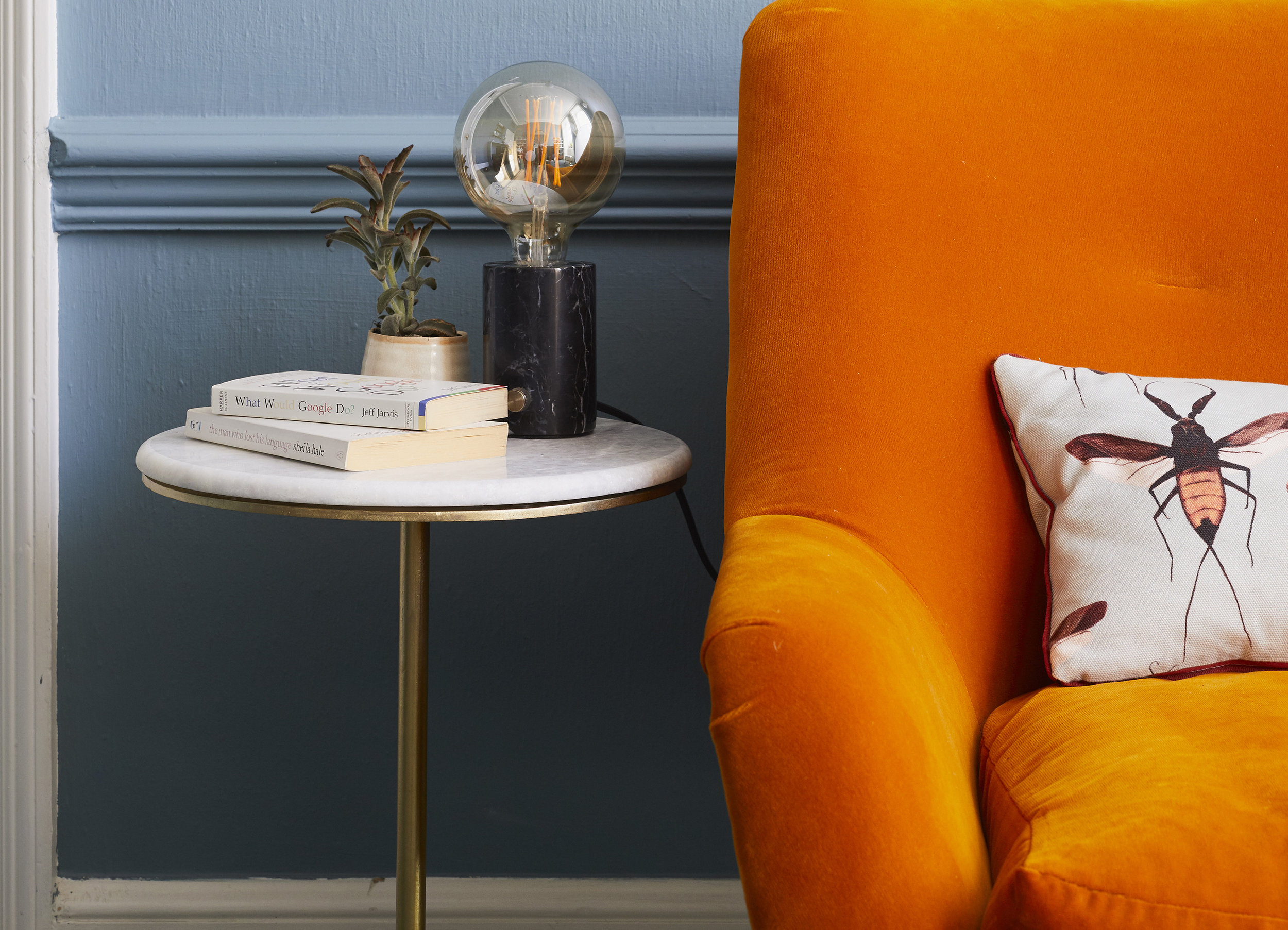
We loved that our brief included wit and we found ways to include small surprises throughout the space from an unexpected pop of colour, a fun print on wallpaper or a cushion, to the combination of characterful plants throughout the space.
Vivacious for this project meant colourful and bold and was illustrated in the office space with splashes of colour or statement furniture pieces.
An office space transformed through interior design
Through the clear brief and the wonderful relationship we developed with our clients, we transformed a somewhat drab office space to one that much better represented the company and the staff that resided within it.
We celebrated the Georgian heritage of the building itself and brought to life the warmth, intelligence, wit and vivacity our clients were after.
This project goes to prove just how transformative good interior design, even on a small works project can be.
The before and after below shows how paint, well chosen furniture and great styling can transform an area without a clear function to one which feels welcoming, warm and homely - just right for clients to visit and as a breakout space to work in.
Like what you see?
Get in touch to discuss transforming your company’s workspace.
More of our work
Share this project:


